
Mando
Mandarin learning tools are built for beginners or experts. Intermediate level resources is scarce as the existent pool of resources were either too easy or too difficult. Without anything in between, intermediate learners plateau and lose momentum in their language learning progress.
How might we help intermediate Mandarin learners reinforce and retain what they already know without slowing them down or overwhelming them?
⚔️ The Challenge
Through competitive analysis and early usability testing, I identified key challenges faced by intermediate learners:
✦
Shallow reinforcement— Apps focused on introducing new vocabulary, not strengthening recall.
✦
Limited flexibility— Learners cannot control how much support (pinyin translation) they see.
💡
✦
Inefficient practice— Manual repetition and mental toggling slow down progress.
Research Findings
User Survey
I conducted a user survey of 14 participants who were at least HSK 3 proficiency.
💡
Biases
While conducting research, I remained aware of potential biases such as sampling bias. The survey participants (14) did not fully represent my target user group, because proficiency varied and was subjected. I treated feedback as directional signals rather than absolute answers.
🔍 What the Research Revealed
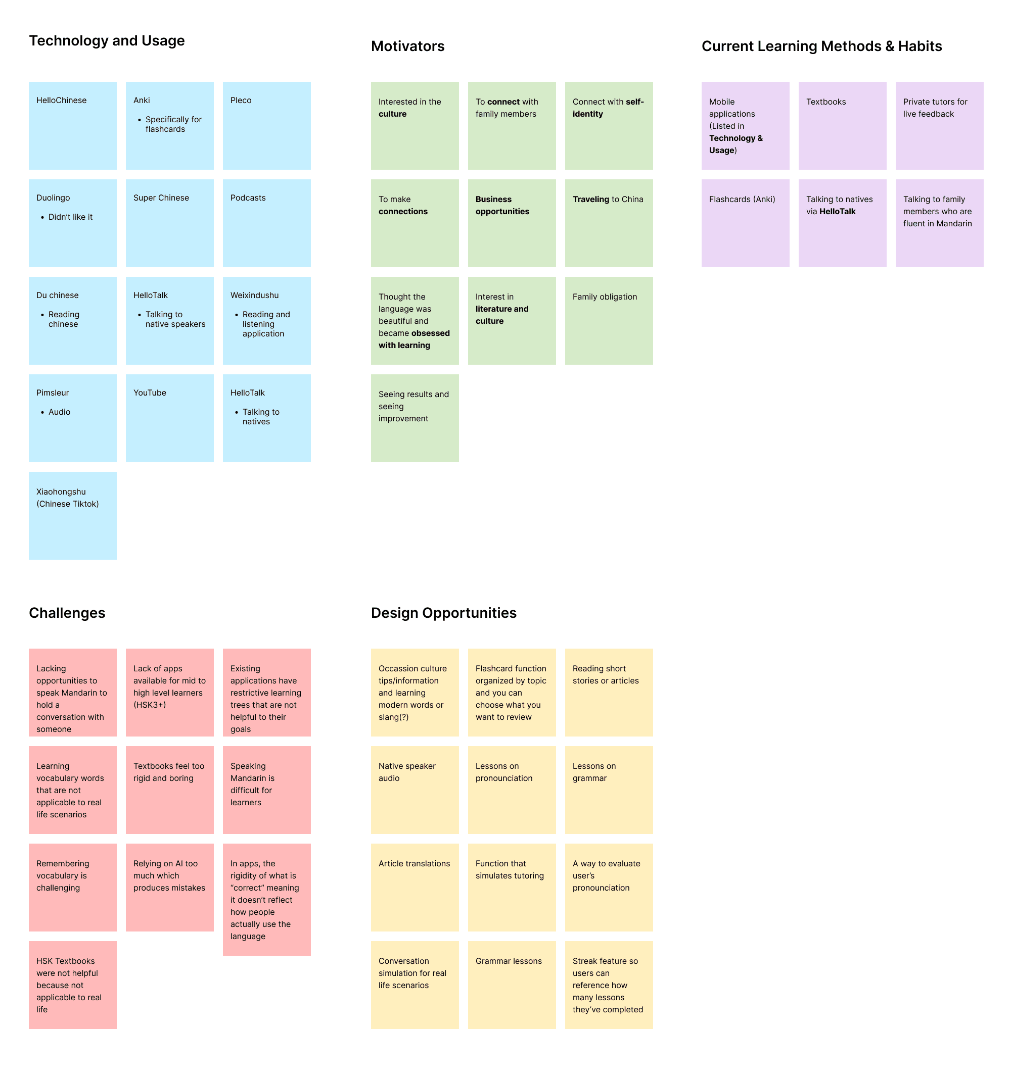
Methods &
Habits Discovered
✦
Uses mix methods like apps, textbooks, private tutoring, immersion, flashcards, note taking.
✦
Most effective was 1:1 private tutoring, flashcard studying, and listening exercises.
Frustrations / Challenges
✦
Gamified or app-based methods help with habit formation (consistency), but sometimes lack depth/context for higher proficiency.
✦
36.4% said their main challenge was speaking Mandarin - Most participants find that there is a lack of applications that are dedicated to high-level learners. Most of the applications are for super beginners.
✦
Mobile applications have restrictive lessons that are not helpful to their goals.
Opportunities for Design
✦
Lessons that are catered to middle to advanced learners- Using the mic to record users’ voices when pronouncing a word and their pronunciation can be evaluated by AI.
✦
Incorporating cultural insights and cultural context when learning. Can include podcasts and reading newspaper articles.
✦
Listening exercises.
✦
Article/story translations.
Laying the Foundation
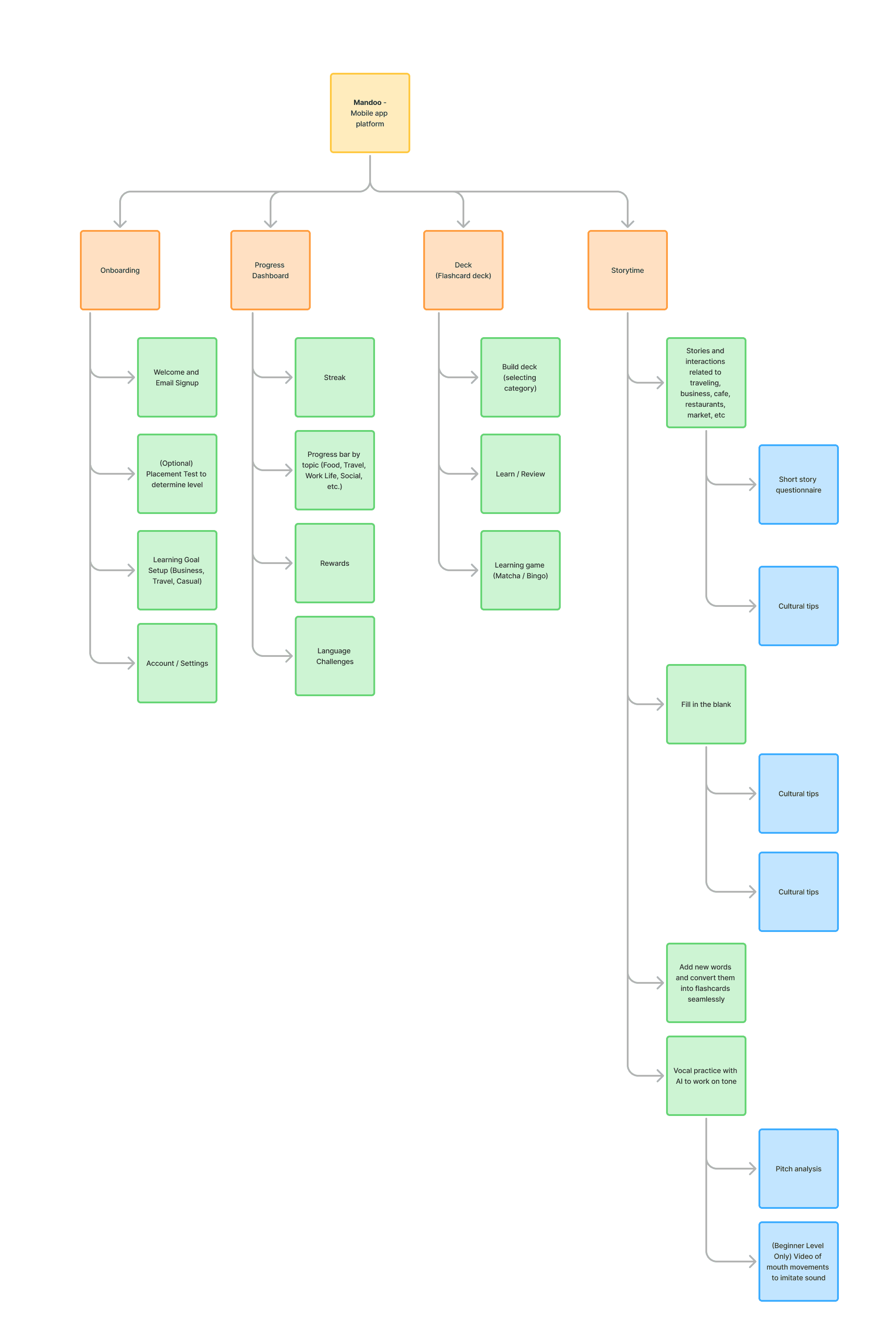
Site Map
The site map helped me understand the overall architecture of the mobile experience before refining individual flows. Rather than organizing screens purely by features, I grouped them by learning intent (discovery, practice, and reinforcement) so users can easily switch between modes without losing context.
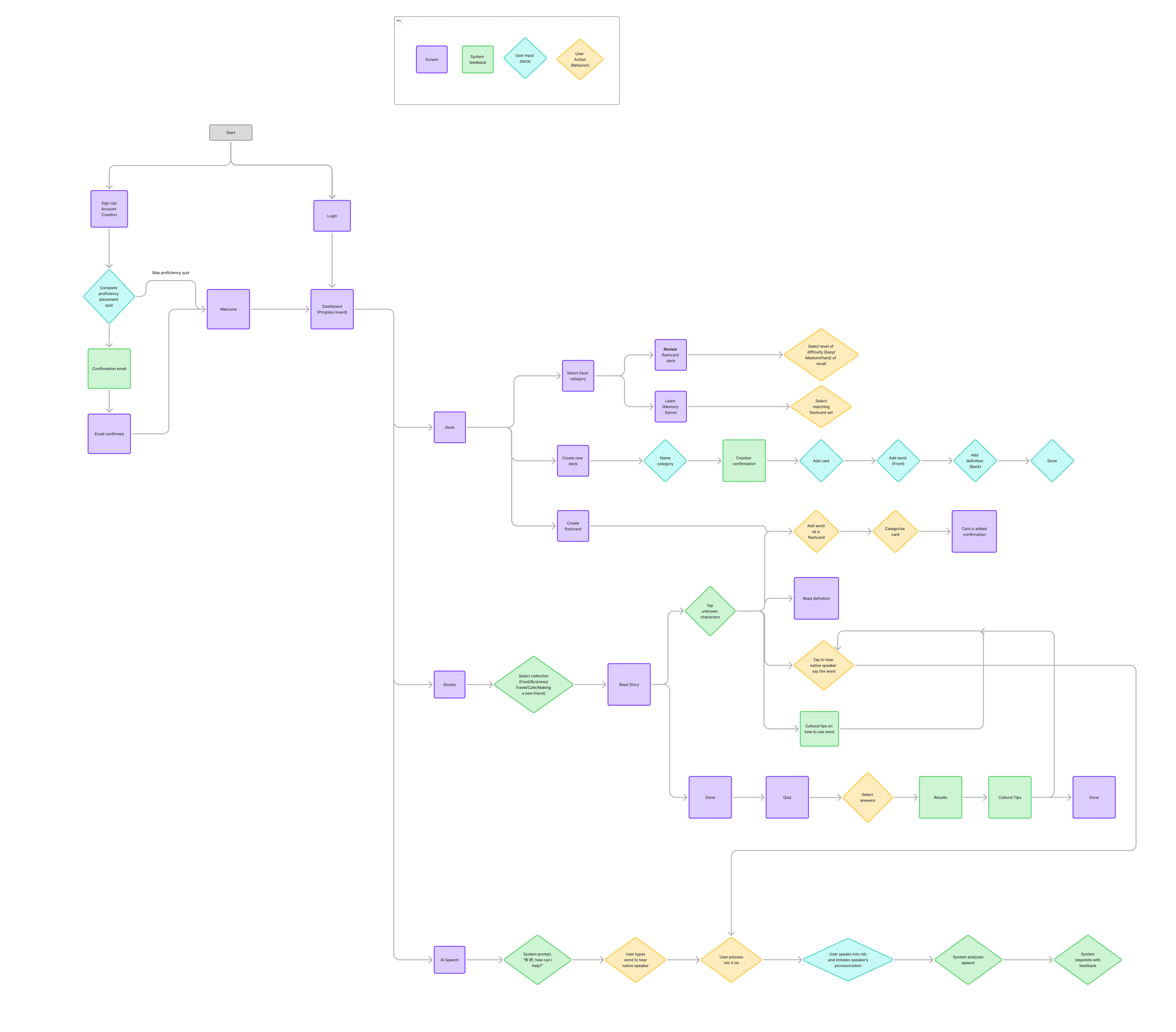
User Flow
The flow begins with login and leads to a central dashboard that serves as a hub for deck management, flashcard review, reading-based study sessions, and AI-powered practice.
The dashboard acts as a decision point, supporting different learning goals and levels of intent while avoiding a forced linear path. This approach helped define a focused MVP around core learning actions while leaving room for future expansion.
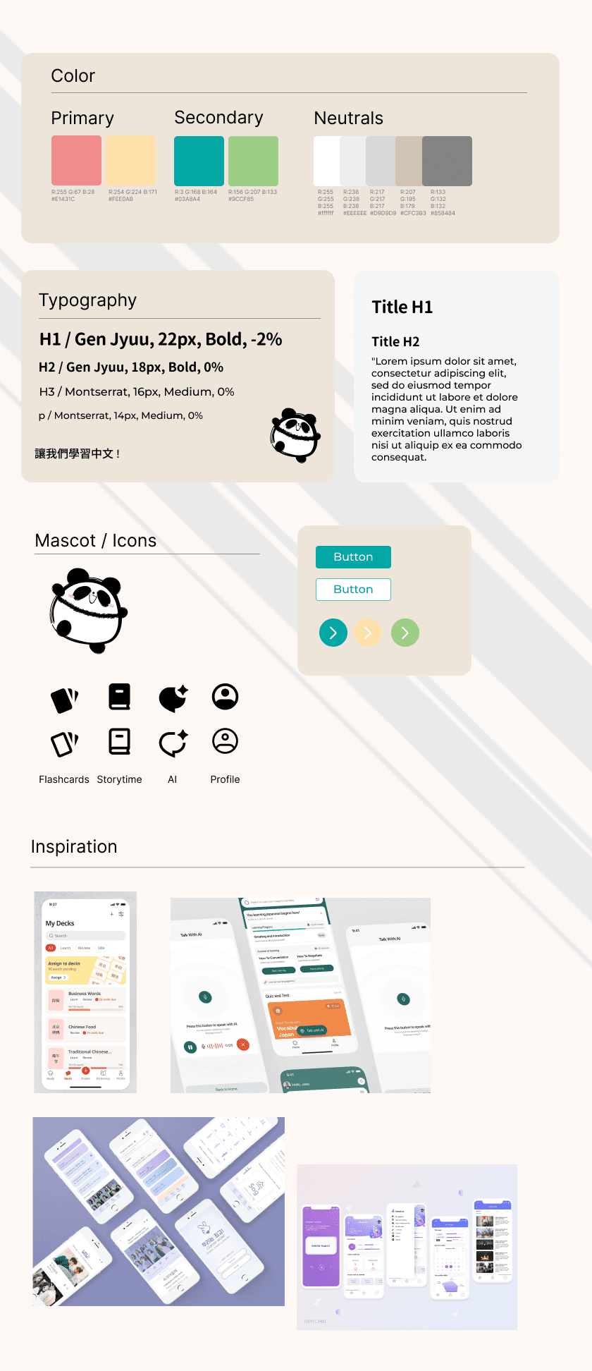
UI Style Guide
Visual Direction
The visual direction for Mando was designed to make studying Mandarin feel fun and inviting. I intentionally designed the interface to lower emotional friction and make practice feel more enjoyable.
I chose a soft color palette, friendly typography, and a lightweight mascot to create a sense of warmth and playfulness
The goal was to create a learning environment that feels supportive, enjoyable, and easygoing.
The design process: High-fidelity
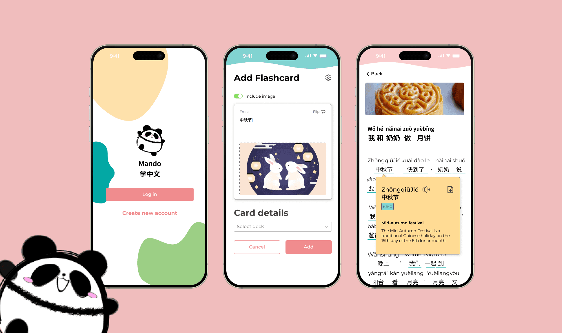
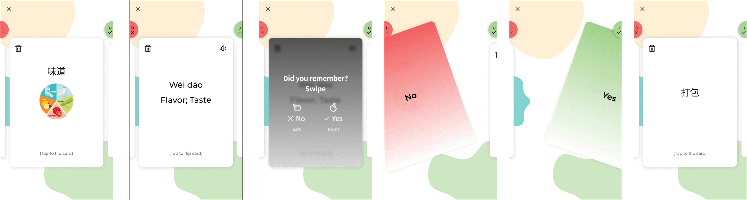
Concept 01: Card Deck Review Experience
While designing the card deck review experience, I focused on intertwining design simplicity and quick user actions (swiping). The main design was to focus the flashcard design and interaction while keeping record of the user actions (remembering or not remembering).
First Iteration
Usability Testing & Iteration
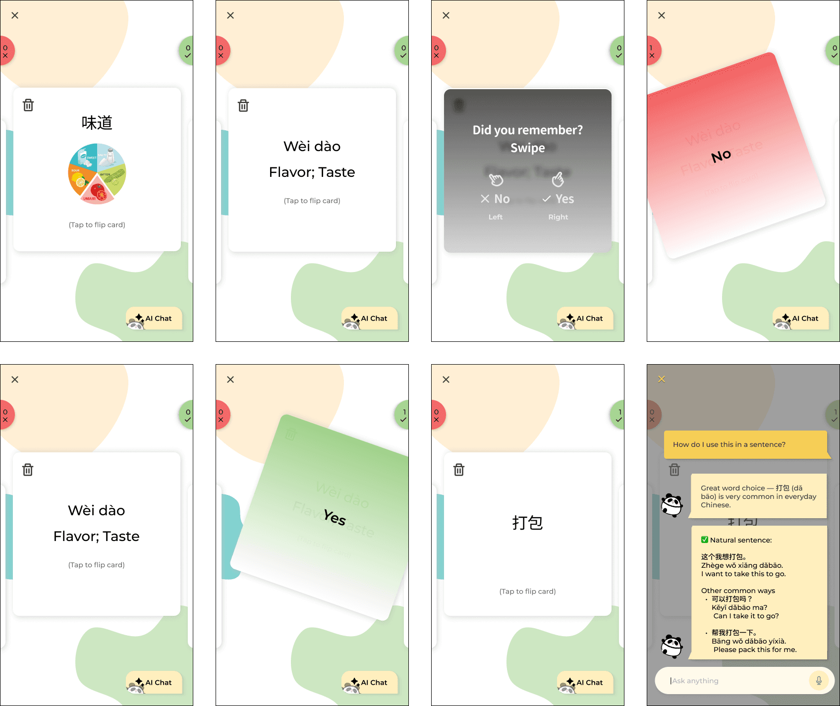
In the next iteration, I focused on refining the card deck review experience based on usability testing feedback. The goal was to improve visual consistency and deepen engagement during active study.
1. Visual consistency between creation and review
👎🏻 Pain point
Participants noticed that the flashcard size during review did not match the dimensions used during card creation, which made the experience feel slightly disconnected.
👍🏻 Solution
I updated the review cards to match the exact proportions used in the Card Creation flow. This improved visual continuity and helped the experience feel more cohesive and intentional across different stages of the product.
2. Adding contextual support during review
👎🏻 Pain point
Several users expressed interest in having more support while reviewing, especially when they wanted clarification around grammar, usage, or nuances of a word.
👍🏻 Solution
I introduced an AI interaction button within the review flow, allowing users to ask contextual questions without leaving their study session. This added flexibility for deeper learning while keeping the primary review experience lightweight and focused.
Before
After
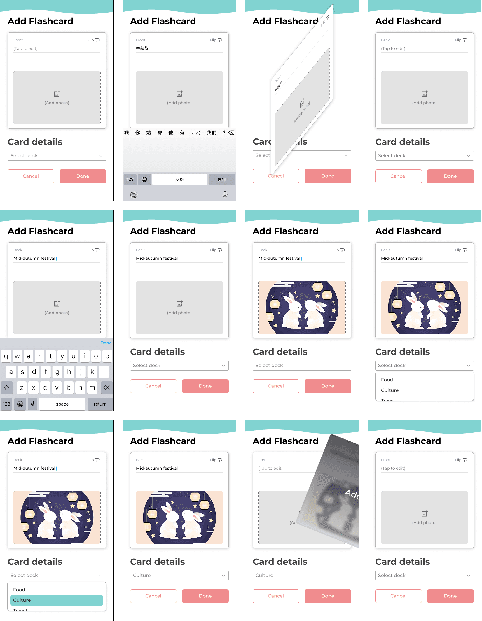
Concept 02: Flashcard Creation
While designing the flashcard creation experience, I focused on reducing cognitive load while preserving the familiar mental model of studying with physical flashcards with the following:
1. One-sided card with tap-to-flip interaction
Cards will reveal one side at a time with a tap-to-flip interaction to mirror physical flashcards and support active recall without overwhelming the learner.
One side of the card prioritizes a single prompt (the English term or the Chinese pinyin) to keep the user focused on recall rather than recognition.
2. Images on either or both sides of the card
Ultimately, I wanted the user to add images to either or both sides of a card. This flexibility will support different learning styles as some learners benefit from visual association while others prefer images as reinforcement after recall. I intentionally did not want to stick to a single rigid learning model.
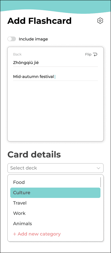
3. Card details and deck categorization
Categorizing cards at creation time will keep decks structured as users add terms to reduce cleanup.
4. Swipe-to-quick-add interaction
The swipe-to-quick-add interaction will allow users to capture new words quickly during studying or discovering. This allows for fast input in the moment while still giving users the option to refine details later.
First Iteration
Usability Testing & Iteration
I conducted usability testing with 8 participants to validate whether the flashcard creation flow felt flexible, intuitive, and supportive of different learning styles. Overall, users found the concept approachable, but testing revealed several opportunities to reduce friction and increase personalization without adding complexity.
1. On-demand image customization
💡 Opportunity
Users wanted more control over when images appear. While visual cues were helpful, having image inputs visible at all times felt excessive for users who didn’t rely on photos.
👍🏻 Solution
I introduced an image toggle setting, allowing users to enable images only when needed. This kept the interface clean while preserving advanced customization for visual learners.
Before
After
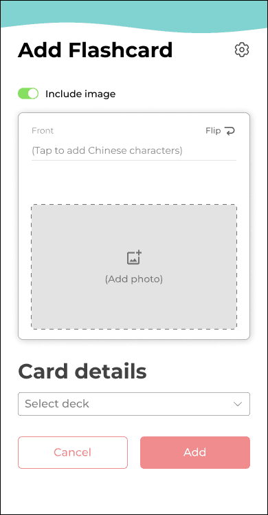
2. Flexible card orientation & review styles
👎🏻 Pain point
Participants felt restricted by the default structure where English always appeared on the front of the card. Many wanted to vary their practice depending on confidence level.
👍🏻 Solution
I added a flashcard customization menu (via a settings icon) that lets users choose:
✦
Which language appears on the front (English or Chinese)
✦
Whether cards are reviewed front-first or back-first (This supports spaced learning and prevents pattern memorization)
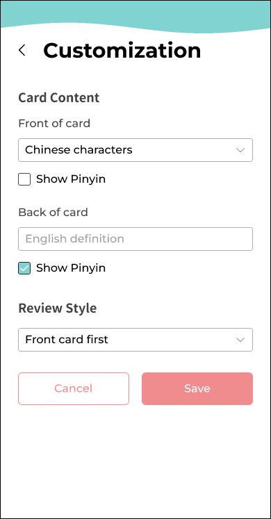
3. Granular pinyin controls
💡 Opportunity
Users requested more nuanced control over pinyin placement, especially when practicing character recognition.
👍🏻 Solution
I added checkbox options to show pinyin on the front, back, both, or neither—allowing learners to gradually reduce reliance on phonetics as proficiency increases.
Final Iteration
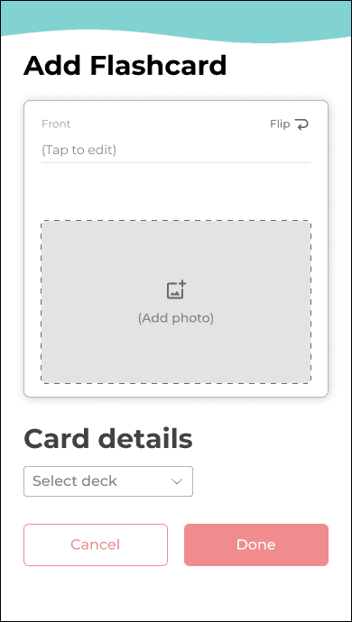
Clearer action labeling
👎🏻 Pain point
During testing, the button label “Done” caused hesitation, as users were unsure whether it saved, exited, or published the card.
👍🏻 Solution
I updated the label to “Add”, making the action and outcome explicit.
Final Iteration
Seamless deck creation during card setup
💡 Opportunity
Several users asked if they could create a new deck while adding a card—an important workflow I hadn’t initially designed for.
👍🏻 Solution
I added a “Create new deck” option directly within the Card Details dropdown, allowing users to stay in flow without breaking context.
Final Iteration
Concept 03: AI Chat
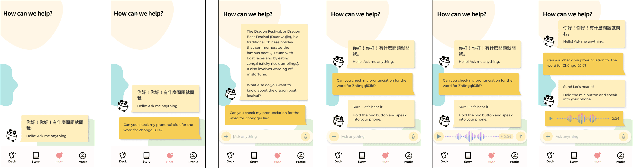
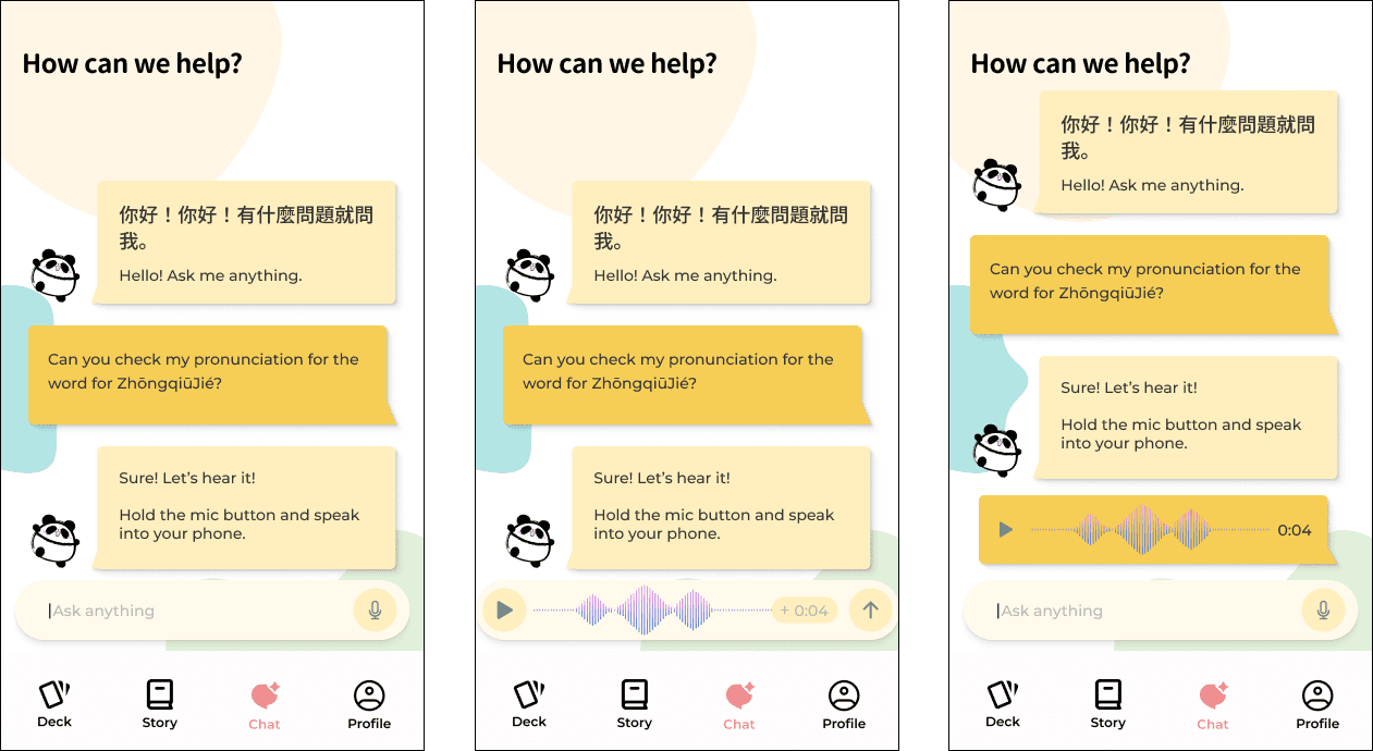
I designed the AI chat feature to feel familiar and low-friction by modeling it after a standard messaging interface. The goal was to reduce the learning curve and allow users to focus on practicing Mandarin rather than figuring out how to use the tool.
Early explorations included allowing users to upload images and use their microphone so the AI could evaluate users’ pronunciation. This idea was driven by the intention to support multimodal learning and provide richer language feedback beyond text alone.
First Iteration
Usability Testing & Iteration
✦
Removing image upload ability
👎🏻 Pain point
During testing, participants consistently questioned the purpose of uploading images in this context as they did not see a clear learning benefit.
👍🏻 Solution
Because the feature added visual complexity without giving value to the user, I removed the “+” icon and the ability to upload an image to keep the interface focused and intentional.
Final Iteration
The Final Design


Reflection
🌟What I enjoyed the most
✦
Overall, I enjoyed the overall concept of the application itself as I am passionate about learning languages and different cultures.
✦
Understanding users and their unique struggles and studying tactics that made them success through user surveys was interesting and creating solutions to those problems was an opportunity to be creative with my problem solving skills. I am particularly proud of the Story feature, but was surprised by how much information and nuances would go into creating a flashcard through each iteration (such as incorporating settings for it).
🎯 Biggest challenges
✦
I was surprised by how much went into creating a mobile flashcard. In person, it’s just filling out each side on paper and then stashing it away or using it to review. However, designing it on mobile was a completely different experience with its own set of unique challenges. For instance, I was surprised by how much organization was required when making a flashcard virtually as well as the customization options that I had to incorporate. I mistakingly underestimated the different ways students and learners would want to make their own cards.
Limitations
Design Limitations
Small sample size: The small sample size was not enough to fully represent the broader intermediate learner population.
Lack of A/B Testing on final designs: Due to the time constraints of this project, there was a lack of validating evidence to show that the final designs outperformed earlier iterations.
Missed opportunities: Creative ways to learn through podcasts or grammar lessons were deferred which left gaps in the learning experience overall. Overall, I was able to ideate solutions to the best of my ability while being realistic with the time constraint of this project.
Research Limitation
The proficiency levels amongst the participants might have varied. There was no validation of their HSK 3 level as there were mainly self-reported.
📈Future plans
Incorporating grammar lessons — The next focus would be expanding learning depth through structured grammar support to complement studying vocabulary.
Visual novel game — A visual novel style mini game that allows users to apply their vocabulary and grammar knowledge in a narrative-based game. This will introduce low pressure, contextual practice to encourage experimentation while engaging users. Users would progress through short story segments by selecting 1 of 4 response options to test their recall, comprehension, and grammar. The user’s choices as well as their accuracy will influence how the story unfolds to create multiple possible endings.
Mandarin podcasts — Users must also practice their listening skills. Podcasts can serve as ways for users to listen in on recordings created by native speakers to test their listening comprehension.
If I could do this project over again to improve this experience:
Explore study modes that are more optimized for time such as incorporating short, fragmented study sessions like 2-minute reviews.
Incorporate a button in the Flashcard Creation screens that temporarily hides secondary controls to further simplify the design.
Perform A/B Testing to truly test my final designs through task completions.
Perform more selective user interviews to understand their mental model behind their responses to truly grasp their pain points.